A brief overview of milestones in
Redesigning the retirement calculator
What needed to be accomplished?
Facilitate rebuilding the current retirement calculator tool as currently hosted by an external agency, costing money.
Improve its design as its appearance is dated, and the tool has low usage.
Increase the number of leads for retirement planning via the tool.
Understand
Work with Stakeholders to define the requirements.
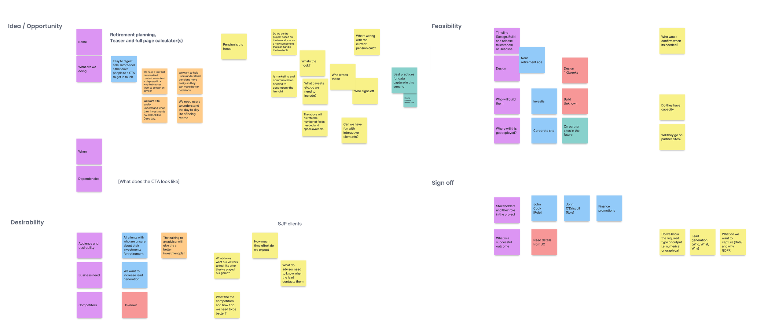
Taking some cues from the Business model canvas, I ran a session to capture further detail from stakeholders around the request.
Using a digital board to collate findings over multiple sessions, thank you Miro.
I translated this into a formal brief with clearly defined expectations, outcomes, and measurements for success to prove the cost-added value.
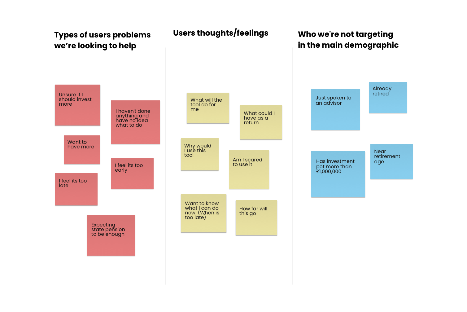
User needs
A broad target was given, and I needed to find common ground to focus on.
I was given a target audience of everyone below retirement age needed to be narrower. I needed to work out how to consider as many users as possible in the available time frame and budget.
I decided to list common value points and use them to measure solution ideas as they could be linked to most users.
Other factors
Lack of retirement goals.
A government body that is trying to raise awareness and uptake by the general public of a retirement plan. I explored research and saw a way that we could use their data.
To service the needs of users looking to understand a retirement plan, these needed to be simple and for users to opt into the more complex (if still required).

Landscape
Review the current tool.
Is there anything we can take away?
Discuss with stakeholders what they like and what must remain included. Make notes on legal requirements. A much easier task when documentation is available.
Review feedback from Users. Test with a few users.
Refine requirements as necessary.

Competitors
What can we learn from other calculators out there?
I knew this wasn’t a new concept, so let’s find out what others have done and how we might stand out.
I discovered a consistent theme over the complex and in-depth list of options. Great if you are in the know, but the tools can’t give fin advice, so making them complex gives the user a false result.
What was needed was to give information fast and then offer advice easily.

Ideation
Start exploring solutions
I set out to integrate retirement living standards thinking into the solutions. This goal-driven thinking in retirement planning is an excellent way to envision annual income needs.
Quick wireframe concepts testing with team members and stakeholders
Workshops with Stakeholders to talk through concepts
Playback concepts to Stakeholders
Small tests on other SJP employees and some friends
Refining content with a content creator to help with the message and language.


Outcome
Too many things
Some good ideas came out, but trying to cover fresh to retirement and more seasoned savers overcomplicated solutions as the users' needs differ.
To make something for both would be over simple for some or too complex for others.
Time to rethink the target audiences and refine requirements.
Project pivot (split)
The business's need to replace was priority.
1. Functional calculator & leads
Those that wanted to understand what they could do to increase their pot and what that could mean to their annual income. Leads from the group have higher value but would take longer to convert.
2. Fresh leads
Those with no knowledge and understanding of retirement goals i.e. didn’t know what an annual income they would need. This group would bring fast turnaround leads.
Both would generate leads at different times in retirement maturity and need a different language to keep things clear. We also needed to prioritise the replacement of the current tool.
Below is a brief overview of what I did on either project.

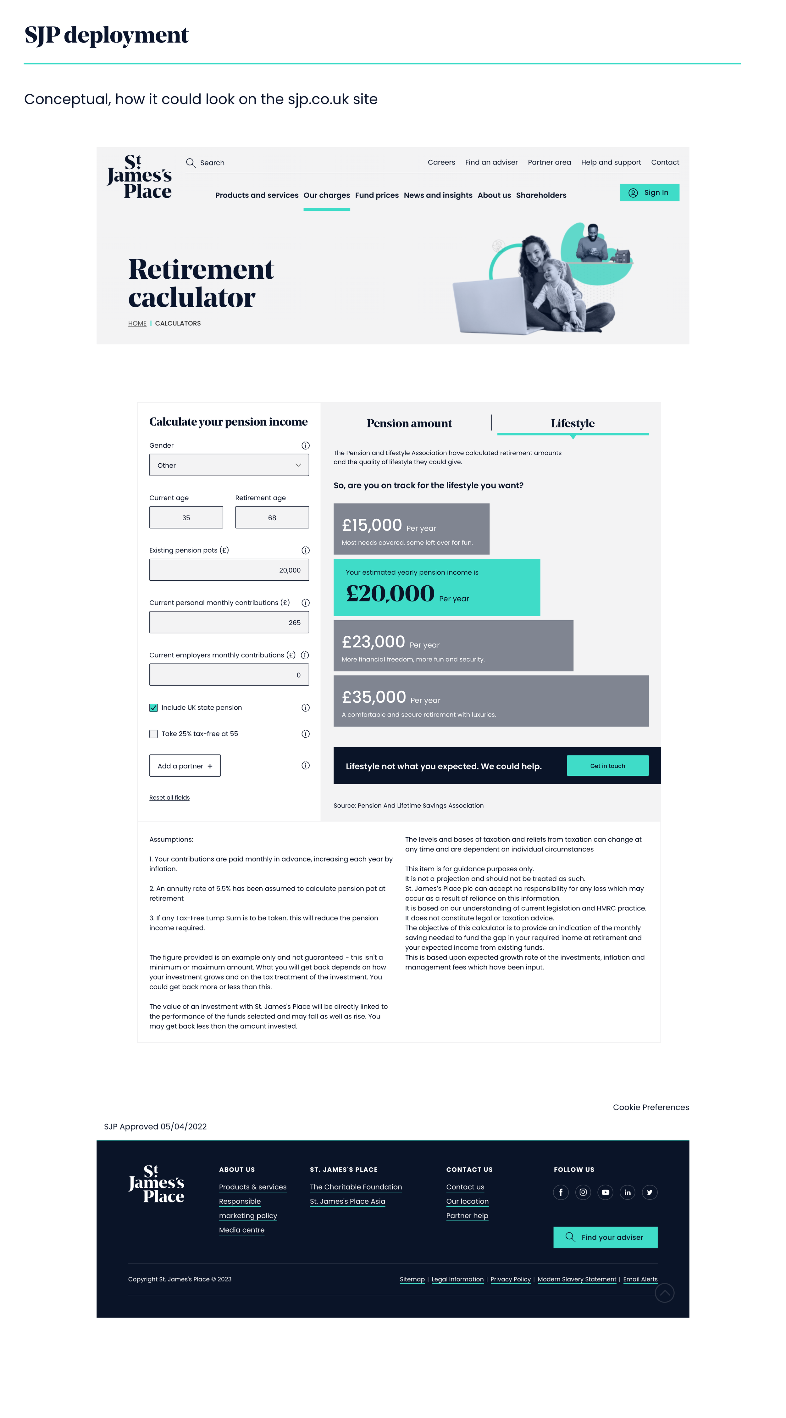
1. Retirement Calculator
Must haves
Replace the current tool ASAP, making the visualization more meaningful
The template needed to be reused for other calculators.
Limited budget, so reuse of current components essential
Ability to increase or decrease inputs. Allow the dev team to flex within the budget and growth in the future.
Nice to haves
Comparisons to retirement lifestyle standards.
Audience
Aimed at those with pension knowledge who want to understand what they might receive as income once they retire.
Advisers who need a tool to illustrate potential growth when talking to clients quickly.

Ideation
Before the split, much of the leg work had been done before the break, so most of this project was to add UI and ensure our messaging was on brand.
Working with a copywriter to help refine messaging, we tweaked the copy so it was constant and worked well with other messaging around the same product retirement.
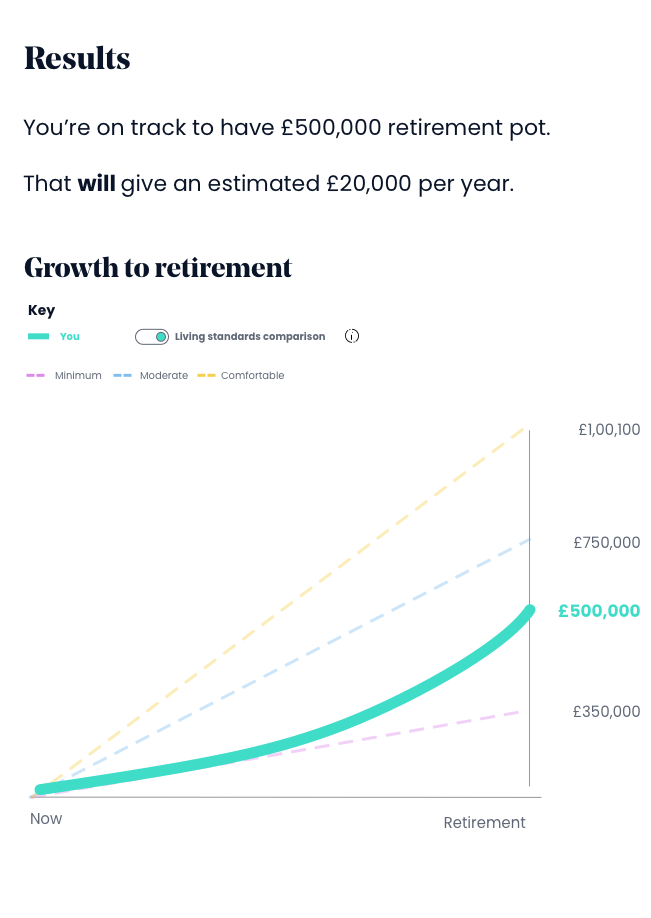
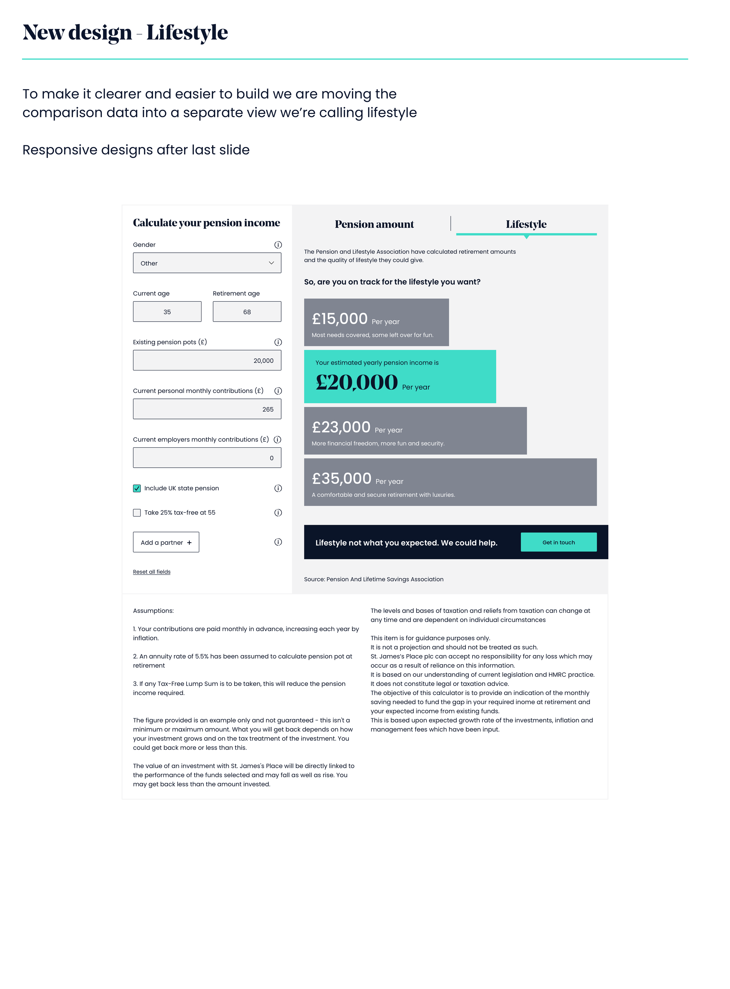
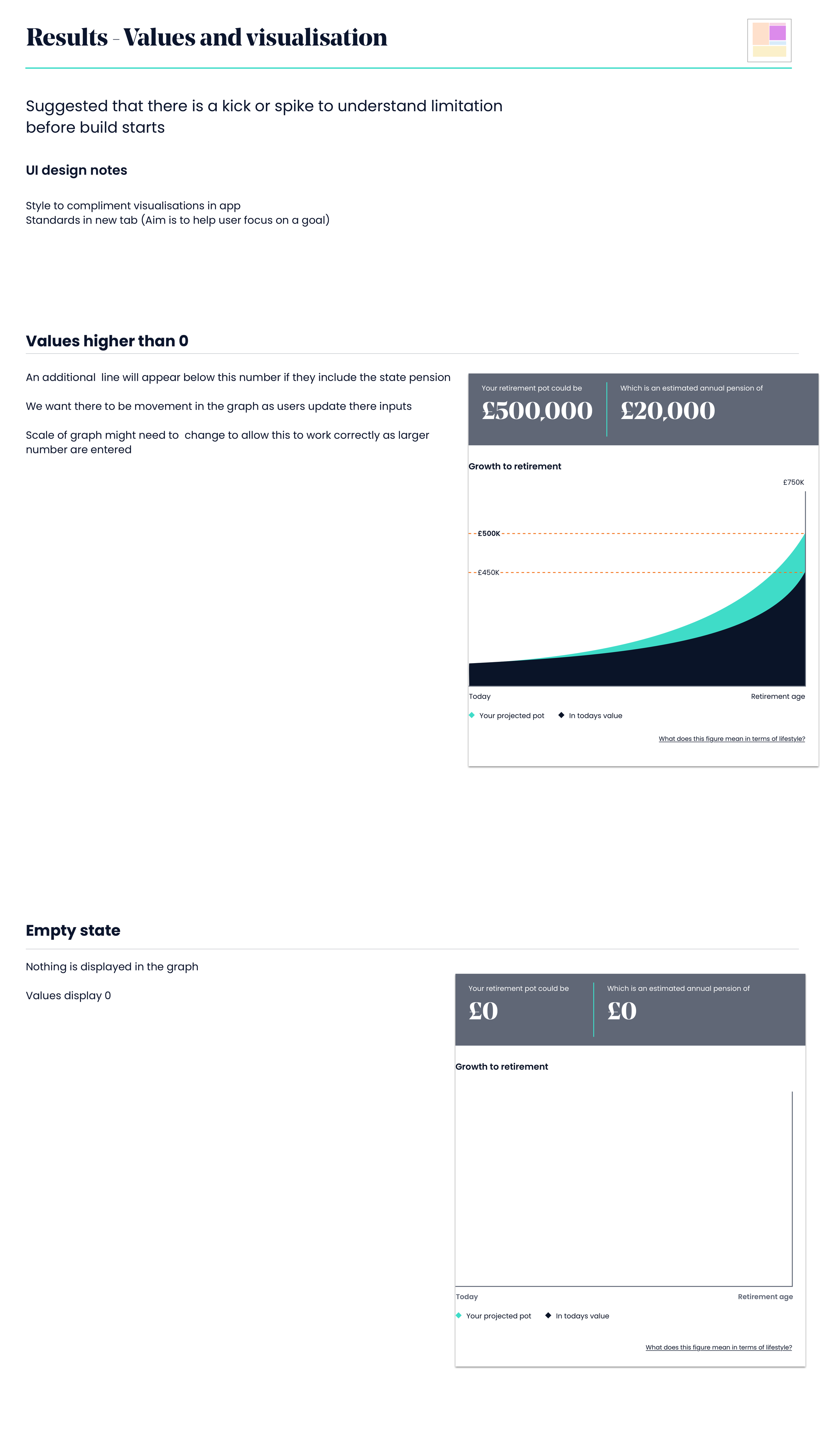
I found that overlaying the living standards data over the growth visualisation was too overwhelming for the user. I separated growth and goals into different views. I also wanted to do this as it made the delivery of the living stands comparison possible, as it could be a standalone bit of work.
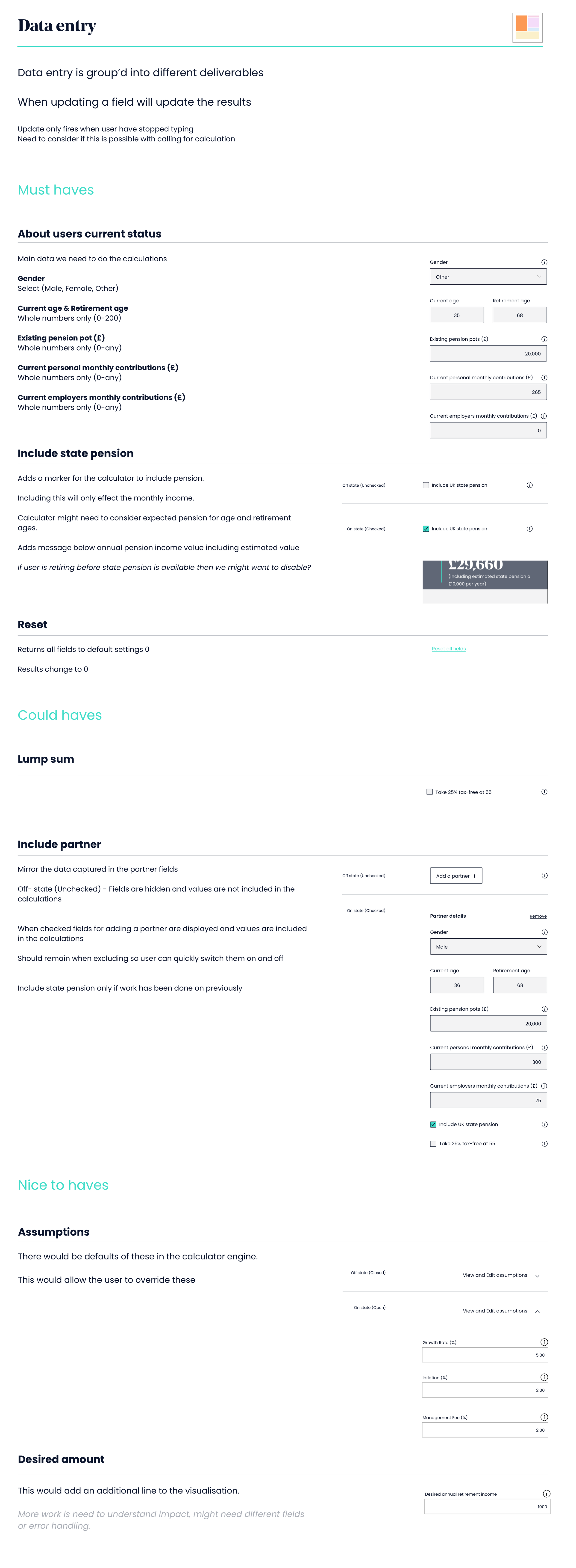
I worked with the team on the calculator to understand the constraints of data. Create a list and visuals for the minimum (MVP) inputs needed and then list additional fields with options.
Tasks
Use Lofi prototypes to get stakeholder buy-in
Test with SJP staff, SJP advisers and end clients to help refine.
Present UX designs to Stakeholders for sign-off.


UI design
The final design was strong on brand and solid in structure. Not going to win any awards for an exciting layout. It could be delivered within budget by the external dev team.
Built modular so that later fields could be added later
Accessibility was considered


Handover
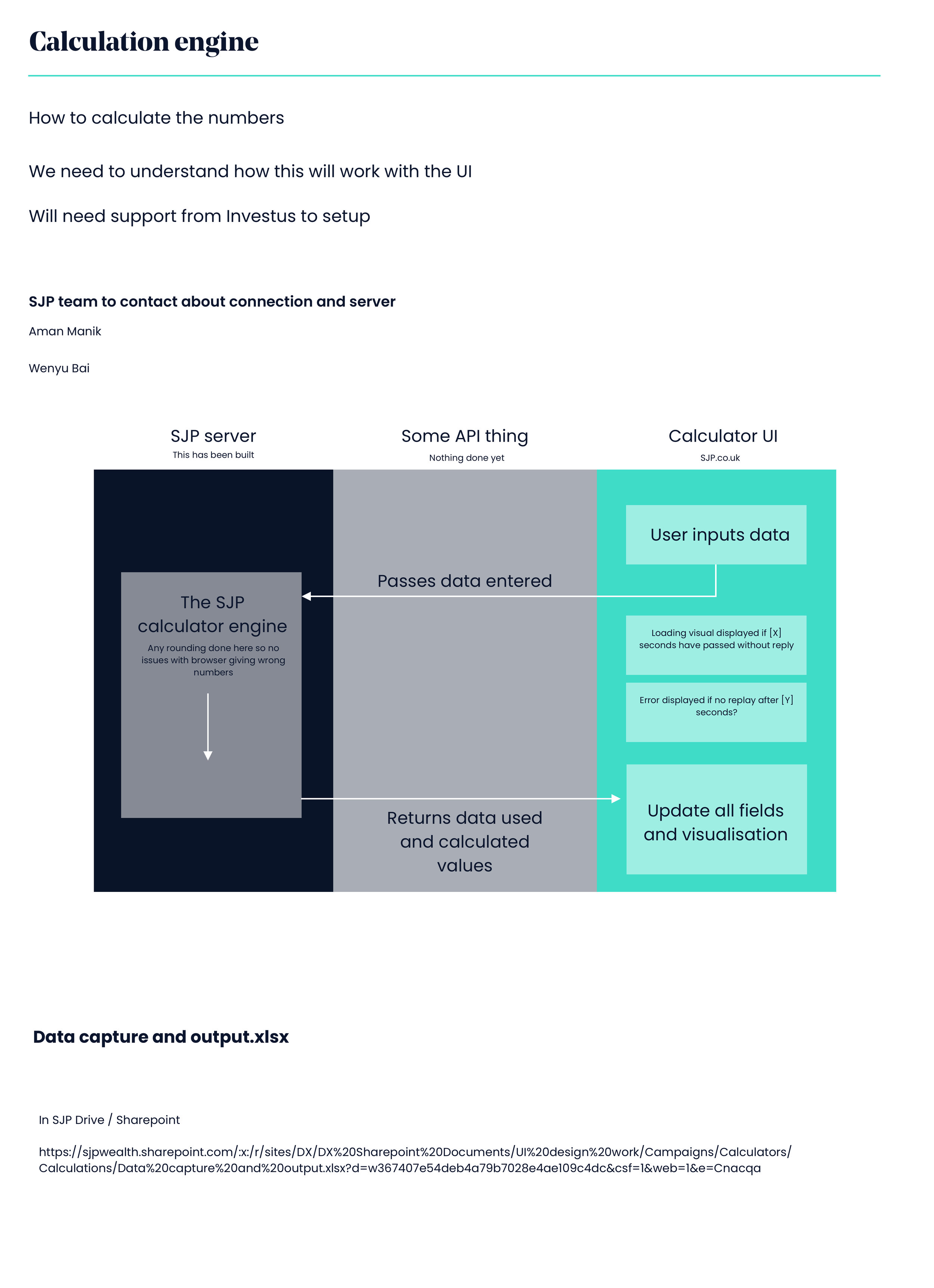
I created several slides to onboard an external dev team. Shared on InVision so we could handle questions remotely.
The main calculations are done by SJP dev/environment, so we need to connect these teams, and this space worked well as a reference point to get the two teams talking as they were different companies.
Responsive
Help to break into deliverables
Wrapup
Project was well received and completed within time for the development team to start work


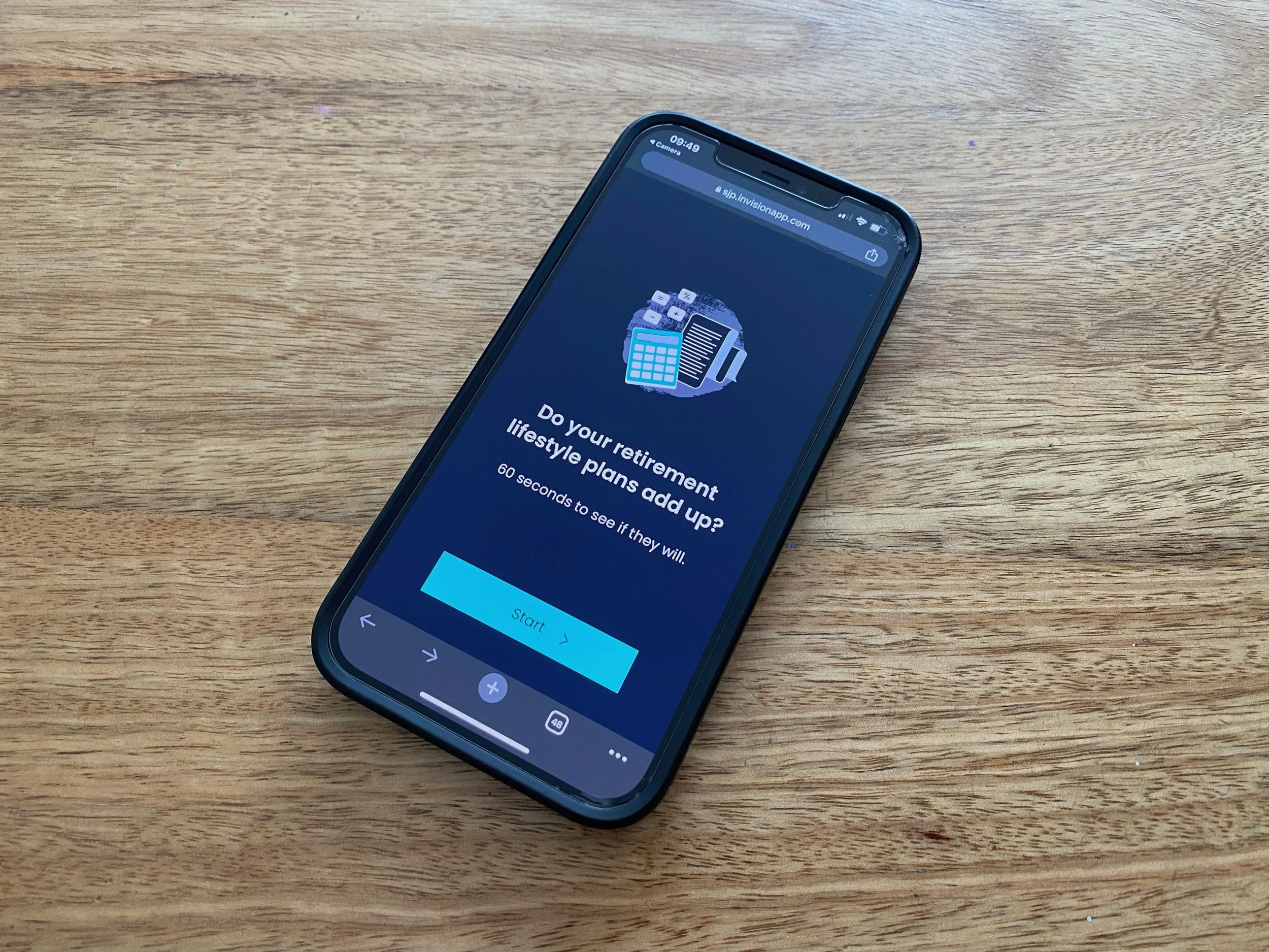
2. Lead generation
The personas within this project needed to learn what an annual income might mean to their lifestyle. We wanted this to be fast and easily deployed. Its power was to highlight an annual income covering their current lifestyle. This gave them a goal when talking to an adviser or onto the Retirement calculator.
The widget was well received, and the pattern is planned for other campaigns.
Explore
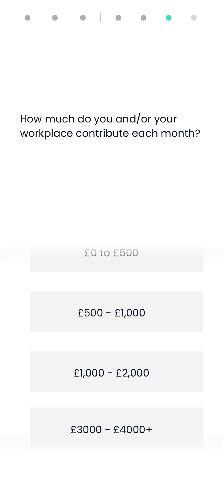
We found that the simple questions at the front were well received during user testing. Later questions requiring data from the user were not, as this changed the feel from light to heavy. We needed the same amount of effort to keep the user assertional and get to the outcome of your pension short. Let SJP help you.
When the user was asked for too in-depth data, they’d lose interest, so we kept the data capture loose. The goal is to build understanding and goals in retirement, not an exact number. The Functional calculator would do this. POlans were to transfer the user from here to the Functional or to an adviser.


Final concept
Some info here…
Many Atoms and Molecules were reused, but half as many new components and templates needed to be added to the Design Library.


Final conclusion
Improvements needed to be made to find an adviser
Changes were needed to the model/position of SJP HQ and the advisers as this tool needs to be more personal to advisers.
Fresh leads need more exploration to gain the best uptake,
More gamification feel is required, and more use of animation to make the experience fun
Feedback was in the form of slides, which the business received well.
With both, the end journey is more straightforward as handing over to the find adviser is clunky.
This was another project I was involved in where the plan was to better integrate the find adviser into other content on the page. Making the free help/advice, SJP can offer easier access and feel less daunting.